Free AI Infographic Generator - Create Data Visualizations
Create professional infographics instantly with AI. Free AI infographic maker powered by Nano Banana Pro and Dreamina. Transform data into stunning visual stories, charts, and diagrams in seconds. Perfect for presentations and reports.
What is AI Infographic Maker?
AI Infographic Maker is a powerful generation tool that leverages advanced artificial intelligence models—including Nano Banana Pro, Dreamina, and SeeDream—to instantly transform raw data, complex concepts, and textual summaries into professional-grade infographics. It bridges the gap between data analysis and visual storytelling, allowing users to create stunning charts, diagrams, and process flows without needing advanced design skills or complex software like Adobe Illustrator.
Whether you need to visualize statistical trends for a business report, map out a historical timeline for education, or simplify a workflow for a presentation, the AI Infographic Maker automates the layout, color theory, and typography selection. By understanding the context of your data, it suggests the most effective visualization method—ensuring your message isn't just seen, but understood.
Key Features 🚀
- Intelligent Text Rendering (Nano Banana Pro) 📝: Unlike older image generators that produce gibberish text, Nano Banana Pro is optimized to render clear, legible labels, titles, and data points directly onto your charts.
- Smart Chart Selection 📊: The AI analyzes your prompt intent (comparison, trend, proportion) and automatically selects the most appropriate chart type (bar, line, pie, etc.) to maximize comprehension.
- Automated Visual Hierarchy 👁️: Automatically structures information with correct font sizing, bolding, and spatial arrangement to guide the viewer's eye through the narrative flow.
- Multi-Style Generation 🎨: Switch between professional clean lines for corporate reports (Nano Banana Pro), vibrant creative styles for social media (Dreamina), or artistic, organic aesthetics (SeeDream).
- Mobile-Responsive Layouts 📱: Generates vertical-first or adaptive designs ensuring your infographics remain readable on smartphone screens and social media feeds.
- Complex Data Simplification 🧩: Capable of condensing dense paragraphs of text or messy data sets into clean, summarized visual points and easy-to-read diagrams.
- High-Resolution Export 🖼️: Produces crisp, high-definition visuals suitable for inclusion in printed annual reports, 4K presentations, and marketing materials.
How to Use AI Infographic Maker?
Creating professional infographics with AI is a streamlined three-step process designed to move from concept to final visual in seconds.
Step 1: Describe Your Data or Concept ✍️
Start by clearly defining what you want to visualize. You don't need formatted CSV files; simply describe the data points or paste the text you want summarized.
- Example: "Create a bar chart comparing smartphone market share in 2024: Brand A 30%, Brand B 25%, Brand C 20%, Others 25%."
- Tip: Be specific about the relationship between data points (e.g., "show the growth trend" vs. "compare the total values").
Step 2: Choose Your Parameters ⚙️
Select the AI model and style settings that best fit your distribution channel:
- For Reports & Data Heavy Charts: Select Nano Banana Pro. Its superior text capabilities ensure axis labels and legends are readable. Use aspect ratios like 16:9 for slides or 4:5 for reports.
- For Social Media Engagement: Select Dreamina. Focus on vibrant colors and simplified visuals that pop on Instagram or LinkedIn feeds. Use 9:16 vertical aspect ratio.
- For Editorial & Art: Select SeeDream for a unique, hand-drawn, or infographic-poster style.
Step 3: Generate and Refine 🔄
Hit generate. The AI will propose a visual layout.
- Review: Check if the chart type matches the data story (e.g., is it using a line chart for trends?).
- Iterate: If the text is slightly off or the colors are too muted, refine your prompt (e.g., "Use a high-contrast color palette" or "Make the title larger") and regenerate.
- Upscale: Once satisfied with the layout, use the upscale feature to ensure text sharpness before downloading.
Use Cases & Example Prompts
AI Infographic Maker adapts to various professional needs, from precise data visualization to engaging social media content. Here are the primary use cases with specific prompt structures to get you started.
1. Statistical Infographics 📉
Best for visualizing survey results, market shares, or growth trends. The goal here is clarity and data precision.
- Best Model: Nano Banana Pro (for text accuracy)
- Key Chart Types: Bar charts, Pie charts, Line graphs.
Example Prompt:
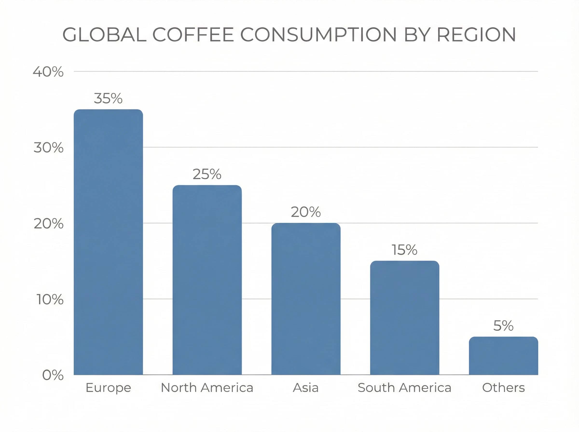
"Create a vertical bar chart showing global coffee consumption by region. Data: Europe 35%, North America 25%, Asia 20%, South America 15%, Others 5%. Style: Flat design, professional, muted blue and grey color palette, clean white background. High resolution, 4:5 aspect ratio."
2. Process & Timeline Infographics ⏳
Ideal for explaining step-by-step procedures, company history, or project roadmaps. These rely on clear directional flow.
- Best Model: Nano Banana Pro (for structure) or Dreamina (for visual flair)
- Key Chart Types: Flowcharts, Roadmaps, Gantt-style charts, Numbered lists.
Example Prompt:
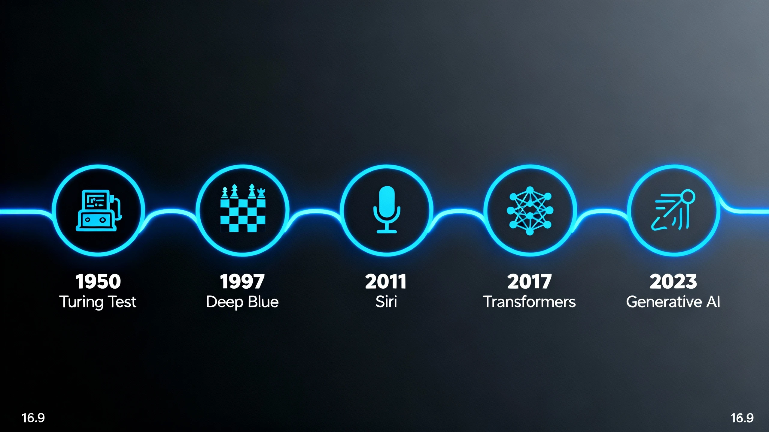
"Design a horizontal timeline infographic for 'History of AI'. 5 milestones: 1950 Turing Test, 1997 Deep Blue, 2011 Siri, 2017 Transformers, 2023 Generative AI. Style: Modern tech aesthetic, neon blue lines on dark background, connecting nodes, icons for each milestone. Wide 16:9 format."
3. Educational Infographics 🎓
Perfect for summarizing complex concepts, 'How-to' guides, or science explainers. These often combine illustrations with text blocks.
- Best Model: Nano Banana Pro (for text heavy) or SeeDream (for artistic concepts)
- Key Chart Types: Anatomical diagrams, Explainer graphics, Comparison columns.
Example Prompt:
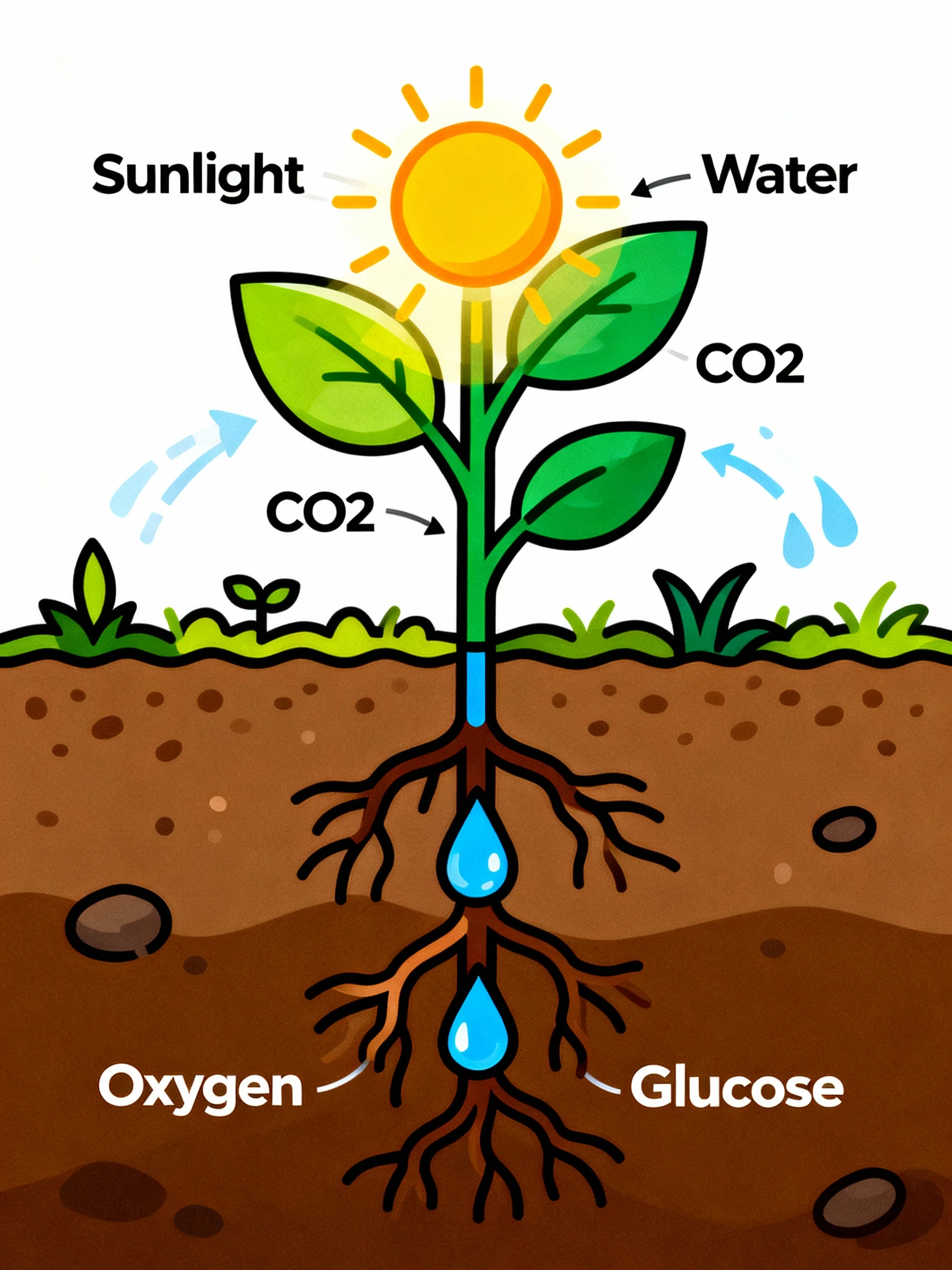
"Generate an educational infographic explaining 'Photosynthesis'. Visual: A stylized plant showing sunlight entering leaves, water from roots, and oxygen releasing. Text labels: 'Sunlight', 'Water', 'CO2', 'Oxygen', 'Glucose'. Style: Vector illustration, bright organic colors, easy to read for students. Vertical layout."
4. Business & Report Infographics 💼
Essential for annual reports, KPI dashboards, and pitch decks. These need to look authoritative and brand-aligned.
- Best Model: Nano Banana Pro
- Key Chart Types: Doughnut charts, KPI cards, Funnel charts.
Example Prompt:
"Create a sales funnel infographic. Four stages: Awareness (1000 leads), Interest (500 leads), Decision (100 leads), Action (50 sales). Style: Corporate minimalist, gradient orange to red, 3D funnel effect, clear bold numbers. White background, suitable for PDF report."
Prompt Writing Guide
To get professional results, your prompt needs to act as a creative brief. Follow this structured approach to ensure the AI understands both the data and the design.
The Perfect Prompt Formula 🧪
[Chart Type/Subject] + [Specific Data Points] + [Visual Style/Theme] + [Layout/Aspect Ratio]
1. Essential Keywords by Chart Type
Helping the AI understand the relationship between your data points is crucial. Use these keywords:
| Goal | Recommended Chart | Keywords to Use |
|---|---|---|
| Compare Values | Bar Chart / Column Chart | "Comparison," "Ranking," "Versus," "Higher/Lower" |
| Show Trends | Line Chart / Area Chart | "Growth," "Decline," "Over time," "Fluctuation," "Trend line" |
| Show Proportions | Pie Chart / Doughnut Chart | "Percentage," "Market share," "Distribution," "Part of whole" |
| Show Process | Flowchart / Diagram | "Step-by-step," "Workflow," "Cycle," "Path," "Roadmap" |
| Show Geography | Map Chart | "Regional distribution," "Global view," "Heatmap," "Territory" |
2. Style & Design Modifiers
Define the aesthetic to match your brand or audience:
- Corporate: "Minimalist," "Flat design," "Swiss style," "Professional," "Muted palette," "Sans-serif typography."
- Creative/Social: "Vibrant," "Gradient," "Isometric 3D," "Neon," "Hand-drawn," "Playful."
- Technical: "Blueprint style," "Wireframe," "Schematic," "Data-dense," "Grid layout."
3. Mobile-Responsive Considerations 📱
If creating for social media, explicitly request layouts that work on small screens:
- Keywords: "Vertical layout," "Mobile-first," "Large text," "High contrast," "Simple icons."
- Aspect Ratio: Specify
--ar 9:16(vertical) or--ar 1:1(square) in your prompts if the tool supports it, or simply ask for "Vertical infographic."
4. Negative Prompts (What to Avoid) 🚫
Use negative prompts to filter out bad design habits common in AI generation:
"blurry text, gibberish text, misspelled labels, messy lines, overlapping text, low resolution, cluttered, distorted shapes, watermark, signature, impossible geometry, neon overuse."
FAQs
Q1: Can AI Infographic Maker interpret my Excel or CSV files directly?
A: Currently, the AI interprets data through natural language prompts. You don't need to upload a file; simply summarize your data points in the prompt (e.g., "Create a pie chart for Q1 Revenue: Product A $10k, Product B $5k, Product C $3k"). For large datasets, extract the key insights into a few sentences first.
Best Practice: Use the summary row from your spreadsheet or top-line metrics that tell the story.
Q2: Which AI model is best for text accuracy in infographics?
A: Nano Banana Pro is the industry leader for legible text rendering:
- Choose Nano Banana Pro when: Your infographic requires specific data labels, percentages, chart axis labels, or explanatory text to be perfectly readable
- Use for: Business reports, statistical charts, educational diagrams, any infographic where text accuracy is critical
- Text capabilities: Can render headlines, data labels, percentages, and short descriptions clearly
Dreamina and SeeDream are better suited for visual concepts where text is secondary or decorative.
Q3: How do I ensure my infographic is readable on mobile devices?
A: Mobile-responsive design strategies:
Layout:
- Use vertical (9:16) or square (1:1) aspect ratios for social media
- Specify "vertical layout" or "mobile-first design" in your prompt
- Keep infographics simple with clear visual hierarchy
Typography:
- Request "large text," "bold headers," and "high contrast" in prompts
- Avoid dense information blocks; break into digestible sections
- Use 3-5 main data points maximum for mobile infographics
Testing: Generate at 1080x1920 (Stories format) and preview on your phone before publishing
Q4: What chart type should I use for my data?
A: Choose based on your data story:
To Show Trends Over Time:
- Line Chart or Area Chart
- Keywords: "growth," "decline," "over time," "trend line"
- Example: Monthly revenue, website traffic, temperature changes
To Compare Values:
- Bar Chart or Column Chart
- Keywords: "comparison," "ranking," "versus"
- Example: Sales by region, product comparisons, survey responses
To Show Proportions/Parts of Whole:
- Pie Chart or Doughnut Chart
- Keywords: "percentage," "market share," "distribution"
- Example: Budget allocation, demographic breakdown, market share
To Show Process/Flow:
- Flowchart or Process Diagram
- Keywords: "step-by-step," "workflow," "path," "roadmap"
- Example: Customer journey, manufacturing process, decision tree
Pro Tip: When in doubt, bar charts are the most universally understood and should be your default for comparisons.
Q5: Can I generate infographics with multiple charts?
A: Yes, with strategic prompting:
Method 1: Single Complex Infographic
Prompt: "Create a dashboard-style infographic with three sections:
top section shows line chart for monthly growth,
middle section has pie chart for market share,
bottom section displays key statistics as cards.
Corporate blue theme, organized grid layout."
Method 2: Generate Separately, Combine Later
- Generate each chart individually at high resolution
- Combine in PowerPoint, Canva, or Photoshop
- Ensures maximum clarity for each data visualization
- Recommended for complex reports
Q6: What resolution should I use for different purposes?
A: Resolution guide for infographics:
Social Media:
- Instagram Post: 1080x1080 (square) or 1080x1350 (portrait)
- Instagram Stories: 1080x1920 (9:16 vertical)
- LinkedIn: 1200x627 (1.91:1 landscape) or 1200x1200 (square)
- Pinterest: 1000x1500 (2:3 vertical)

Presentations:
- PowerPoint/Keynote: 1920x1080 (16:9) or 2560x1440 (HD)
- Full Slide: Match presentation dimensions

Print Materials:
- Reports/Brochures: 2048x2048 minimum (4K preferred)
- Posters: 4K (3840x2160) or higher
- Always consult printer for specific requirements

Web/Blog:
- Blog Posts: 1200x800 or 1200x1200
- Website Graphics: 2048x1024 (responsive width)
General Rule: Generate at highest resolution available (4K with Nano Banana Pro), then downsize for specific platforms
Q7: How do I maintain brand consistency across infographics?
A: Brand consistency strategies:
1. Create a Standard Prompt Template:
[Data/Content] + "Style: [Your Brand Style]," + "Colors: [Brand Colors]," + "Typography: [Font Style]"

Example:
"[Your infographic content]. Style: Minimalist corporate,
Colors: Navy blue #003366 and orange #FF6600,
Typography: Clean sans-serif, professional layout."
2. Lock Visual Elements:
- Use the same color palette description in every prompt
- Specify the same design style ("flat design," "isometric," etc.)
- Request consistent layout structure
3. Reference Previous Outputs:
- If your tool supports image-to-image generation, use your first approved infographic as a style reference for subsequent ones
4. Brand Kit Integration:
- Describe your brand colors explicitly ("Royal blue and gold")
- Mention brand personality ("professional tech startup," "playful children's education")
Q8: Can I use AI-generated infographics commercially?
A: Yes, infographics generated with our platform can typically be used commercially:
Allowed Uses:
- Business reports and presentations
- Marketing materials and social media
- Website content and blog posts
- Client deliverables and proposals
- Educational materials and courses
- Print publications (with proper resolution)
Best Practices:
- Review platform-specific terms for commercial licensing
- Pro/Business plans typically include full commercial rights
- Verify data accuracy independently (AI generates visual representations; you're responsible for data integrity)
- For financial/medical/legal data visualizations, have experts review before publication
Q9: What if the AI misinterprets my data?
A: Troubleshooting data interpretation:
Common Issues & Fixes:
Issue: Wrong chart type generated
- Fix: Be explicit: "Generate a BAR CHART (not pie chart) showing..."
Issue: Data values are incorrect
- Fix: List data in simple format: "Product A: 30%, Product B: 25%, Product C: 45%"
- Avoid complex sentences; use clear number associations
Issue: Labels are missing or wrong
- Fix: Specify: "Label each bar with product name and percentage"
- Use Nano Banana Pro for best text rendering
Issue: Layout is cluttered
- Fix: Simplify data points (use top 5 instead of all 20), request "minimal design"
Iteration Strategy: Generate, review, refine prompt, regenerate. Usually 2-3 iterations yield perfect results.
Q10: Can I edit the infographic after generation?
A: Post-generation editing options:
Within AI Platform:
- Regenerate with tweaks: Adjust prompt and generate variations
- Inpainting/Editing tools: Some platforms allow you to mask areas and regenerate specific sections
- Upscaling: Increase resolution for final output
External Editing Tools:
For Minor Tweaks:
- Canva: Import PNG and add/adjust text overlays, fix typos, add logos
- Figma: Layer additional elements, adjust colors, create templates
- PowerPoint: Quick fixes, text adjustments, cropping
For Major Edits:
- Adobe Photoshop: Professional retouching, color correction, compositing
- Adobe Illustrator: Convert to vector (if needed), precise adjustments, print preparation
Best Workflow: Generate base infographic with AI (gets you 80-90% there), then refine final 10-20% in your preferred design tool. This combines AI speed with human precision.
Ready to transform your data into visual stories? Start creating professional infographics with Nano Banana Pro, Dreamina, and SeeDream today. Turn complex information into engaging visuals in seconds!