Free AI Presentation Chart Generator - Create PowerPoint Charts
Generate professional presentation charts instantly with AI. Free chart generator powered by Nano Banana Pro and Dreamina. Create PowerPoint charts, diagrams, and business visuals in seconds. Perfect for presentations and reports.
1. What is Presentation Chart Generator?
A presentation chart generator creates professional business charts, diagrams, and data visualizations specifically optimized for PowerPoint, Keynote, and slide presentations. Powered by Nano Banana Pro (Gemini 3 Pro Image), Dreamina, and SeeDream, transform your data and concepts into clear, impactful slides in seconds. From quarterly reports to investor pitches, create charts that are readable from the back of the room and designed to persuade.
Key Features:
- 📊 Multiple Chart Types: Bar charts, line graphs, pie charts, funnels, flowcharts, and business diagrams
- 👁️ Distance Readability: Large fonts (≥18pt), high contrast, and clear labels optimized for projection
- 🚀 PowerPoint-Ready: Standard 16:9 format, drag-and-drop into any presentation software
- 💼 Professional Quality: Corporate aesthetics with brand-appropriate color schemes
- 📈 Data Storytelling: Intelligent visual hierarchy that guides viewer attention
- 🔄 Quick Iterations: Generate multiple chart variations to find the perfect visual
- 💎 4K Export: Ultra-high resolution for LED walls and large conference screens
2. How to Use Presentation Chart Generator?
Create professional presentation charts in 3 simple steps:
Step 1: Describe Your Chart Concept
Enter your data visualization concept. Include chart type, data points, and presentation context.
Example:
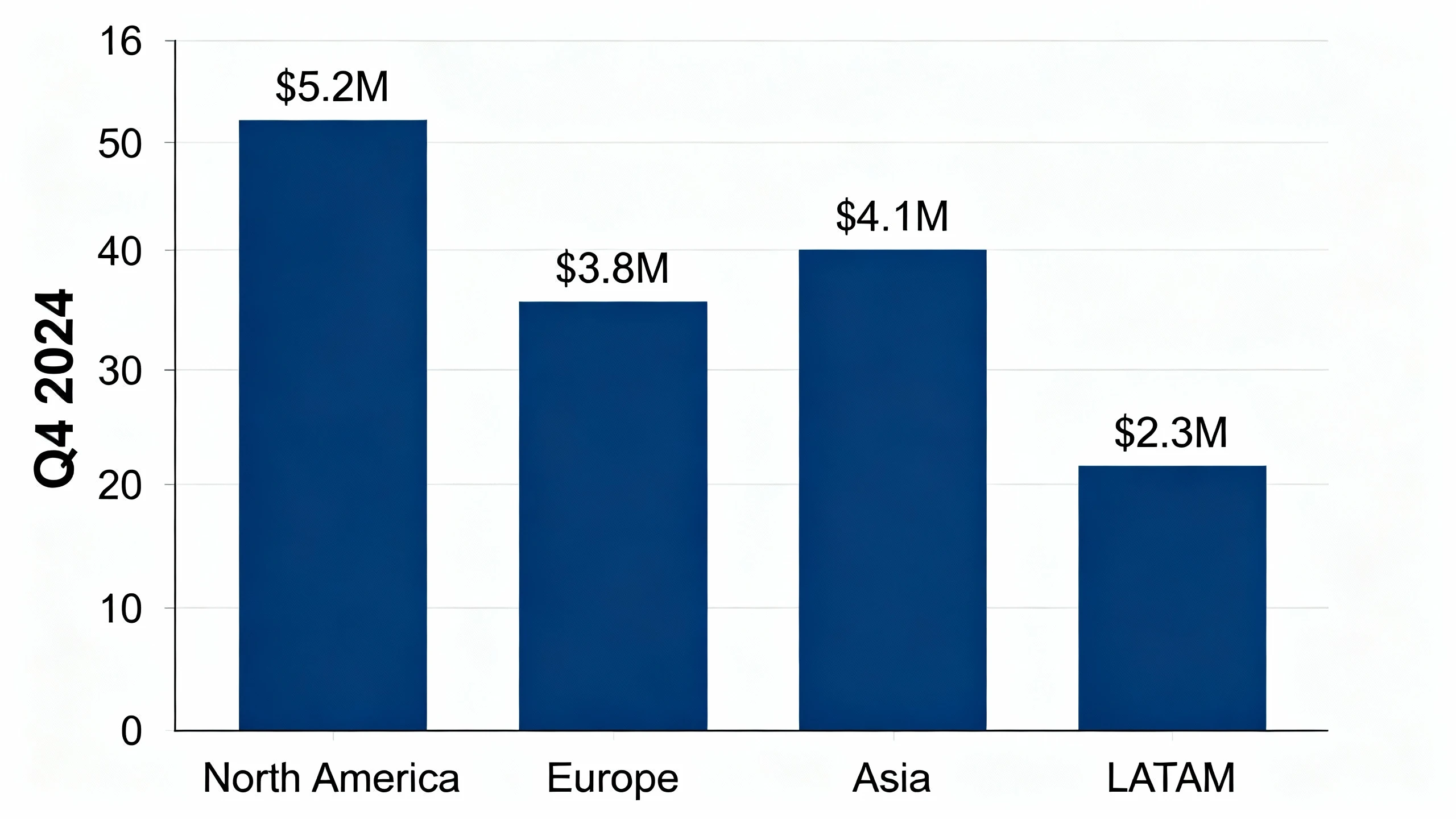
"Vertical bar chart showing Q4 2024 regional sales performance.
Data: North America $5.2M, Europe $3.8M, Asia $4.1M, LATAM $2.3M.
Corporate style, navy blue bars, white background,
large clear labels, suitable for boardroom presentation"
💡 Chart Prompt Writing Tips:
- Specify exact chart type (bar chart, line graph, pie chart, funnel, flowchart)
- Include data points or key messages to visualize
- Request "large text," "high contrast," and "clean labels" for readability
- Mention presentation context (boardroom, investor pitch, conference)
- Define color scheme (corporate, brand colors, high-contrast)
- Specify background (white background for projectors, dark for LED walls)
Step 2: Choose Generation Parameters
Customize your generation settings:
- 🎨 AI Model Selection: Choose the right model for your presentation style
- Nano Banana Pro: Best for charts with text/data labels, maximum clarity, professional business presentations. Ideal for financial reports and data-heavy slides.
- Dreamina: Perfect for modern, vibrant business presentations with contemporary aesthetics. Great for marketing and startup pitches.
- SeeDream: Ideal for executive presentations with sophisticated, muted color palettes and elegant design.
- 📐 Image Size: Choose resolution for your presentation needs
- Standard HD: 1920×1080 (16:9) - most projectors
- High-Res: 2560×1440 (16:9) - modern screens
- 4K: 3840×2160 (16:9) - large LED walls, conference centers
- Square: 2048×2048 - for reports or social sharing
- 🎲 Generation Quantity: Generate 2-4 variations for comparison
- ⚠️ Negative Prompt (optional): Exclude elements like small fonts, cluttered layouts, low contrast, or complex backgrounds
💡 Note: Always prioritize readability—if you can't read the chart in the thumbnail, your audience won't see it on screen.
Step 3: Generate & Export for Slides
Click "Generate Chart" and AI creates your visualization in 10-20 seconds.
After generation, you can:
- 📥 Download High-Res: Save as PNG/JPG and drag into PowerPoint/Keynote
- 🔄 Create Variations: Adjust colors, chart types, or layouts
- 📊 Generate Series: Create consistent charts for multi-slide decks
- 🎨 Refine Details: Regenerate with improved data labels or clearer layout
- 💼 Brand Alignment: Ensure charts match corporate color schemes
- 🖼️ Export Multiple Formats: Create versions for different presentation contexts
2. How to Use Presentation Chart Generator?
Create professional presentation charts in 3 simple steps:
Step 1: Describe Your Chart Concept
Start by defining the message you want to convey. Be specific about the data points, the type of comparison (e.g., year-over-year growth), and the chart style.
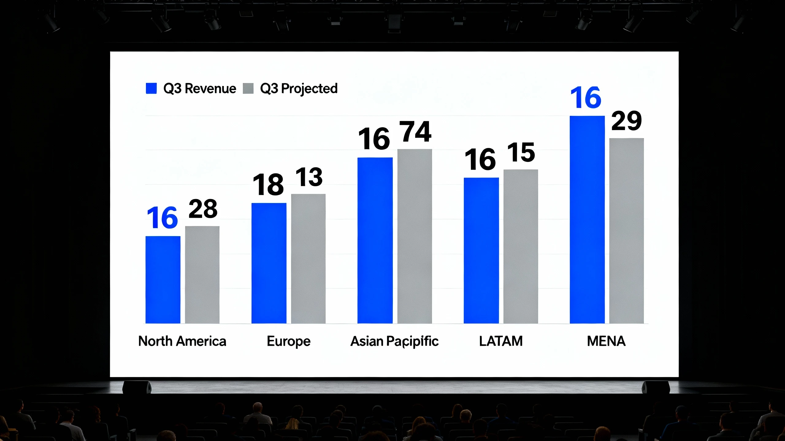
Create a double bar chart comparing "Q3 Revenue" vs "Q3 Projected" for 5 regions: North America, Europe, Asia-Pacific, LATAM, and MENA. Use a corporate blue and grey color scheme. High contrast, clean white background. Large, bold labels for easy reading.
💡 Chart Prompt Writing Tips:
- Specify the Goal: State clearly if you are comparing, showing trends, or highlighting a part-to-whole relationship.
- Define the Axes: Explicitly mention what should be on the X and Y axes to ensure accurate structural generation.
- Set the Mood: Use keywords like "minimalist," "executive," "vibrant," or "serious" to guide the aesthetic.
- Limit Text: AI works best with concise labels; avoid asking for paragraphs of text inside the chart image.
- Color Control: Mention specific colors (e.g., "navy blue bars with gold highlights") to match your presentation theme.
- Contextual Clues: Add phrases like "suitable for a pitch deck" to influence the layout and font sizing.
Step 2: Choose Generation Parameters
- 🎨 AI Model Selection:
- Nano Banana Pro: Best for charts requiring specific, legible text labels and numbers.
- Dreamina: Ideal for conceptual, artistic, or futuristic data visualizations.
- SeeDream: The go-to model for standard, clean, executive-style business charts.
- 📊 Image Size: Select presentation-native resolutions like 1920x1080 (16:9) or 2560x1440 to fill the slide without cropping.
- 🎲 Generation Quantity: Generate 4 variations to see different layout options.
- ⚠️ Negative Prompt: Use terms like "blurry text, small fonts, cluttered, low contrast, dark background, distorted lines" to avoid common issues.
Step 3: Generate & Export for Slides
Once generated, review the charts for accuracy and clarity. Select the best version that fits your narrative.
- One-Click Download: Save immediately in high-quality PNG or JPG format.
- Background Removal: Use built-in tools to remove backgrounds for seamless overlay on colored slides.
- Upscale: Enhance resolution up to 4K for critical keynote presentations.
- Variation Creation: Click "Vary" on a preferred result to tweak minor details like color balance or label placement.
- Edit Region: Use in-painting to correct specific data labels or adjust a specific bar height.
- Prompt Reuse: Copy the successful prompt to generate a consistent suite of charts for the entire deck.
3. Presentation Chart Generator Use Cases & Example Prompts
3.1 Business Presentations
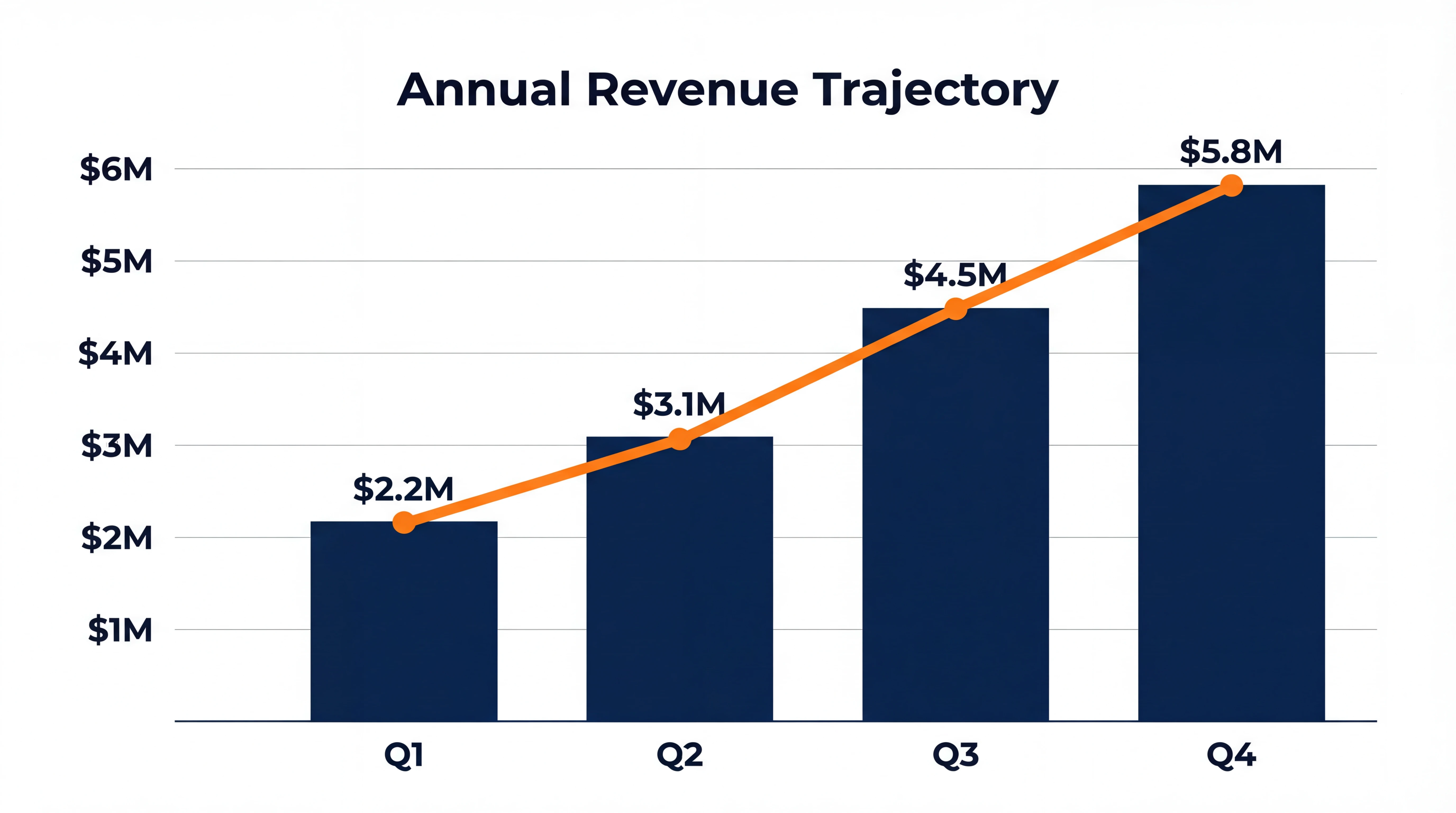
A. Quarterly Business Reviews (QBR)
- Use Cases: Revenue performance, budget utilization, year-over-year growth.
- Key Points: Needs strict accuracy, clean lines, and neutral corporate colors.
- Recommended Model: Nano Banana Pro
Professional column chart showing Q1 to Q4 Revenue Growth. Columns should be dark blue. Add a trend line in bright orange overlaying the columns. Clear axis labels with '$' currency signs. White background, 16:9 aspect ratio, 4k resolution. Title 'Annual Revenue Trajectory' at the top.
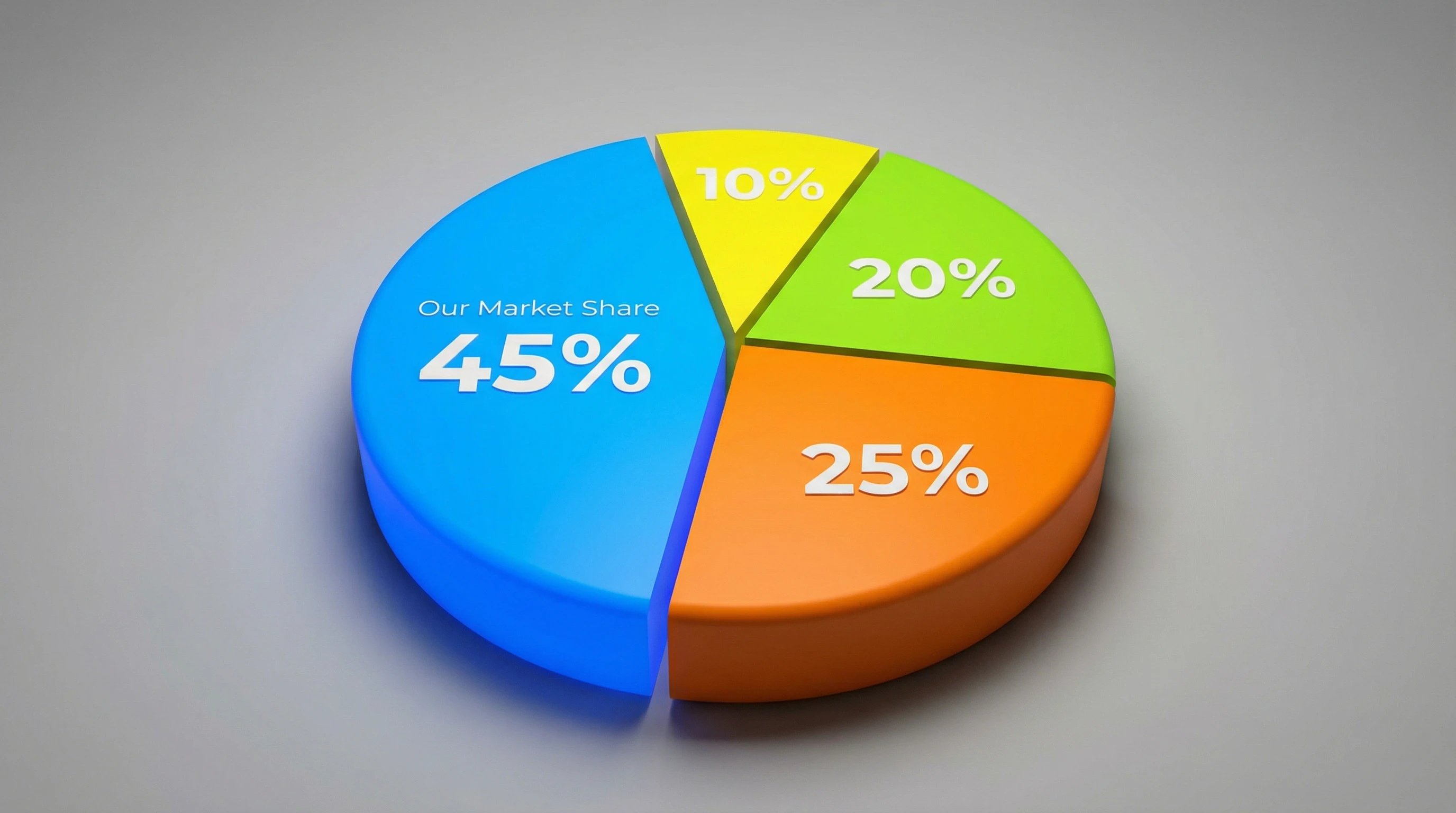
B. Sales Decks
- Use Cases: Market share dominance, competitive analysis, customer acquisition funnels.
- Key Points: Persuasive, high-impact visuals, often using psychological colors like red or green for emphasis.
- Recommended Model: Dreamina
3D Pie chart emphasizing 'Our Market Share' as the largest slice pulled slightly apart. Vibrant brand colors. Minimal text, large percentage numbers: 45%, 25%, 20%, 10%. Clean, modern look, soft shadows, studio lighting.
C. Strategy Presentations
- Use Cases: Roadmap timelines, SWOT analysis matrices, organizational structures.
- Key Points: Focus on structure and flow rather than raw numbers.
- Recommended Model: SeeDream
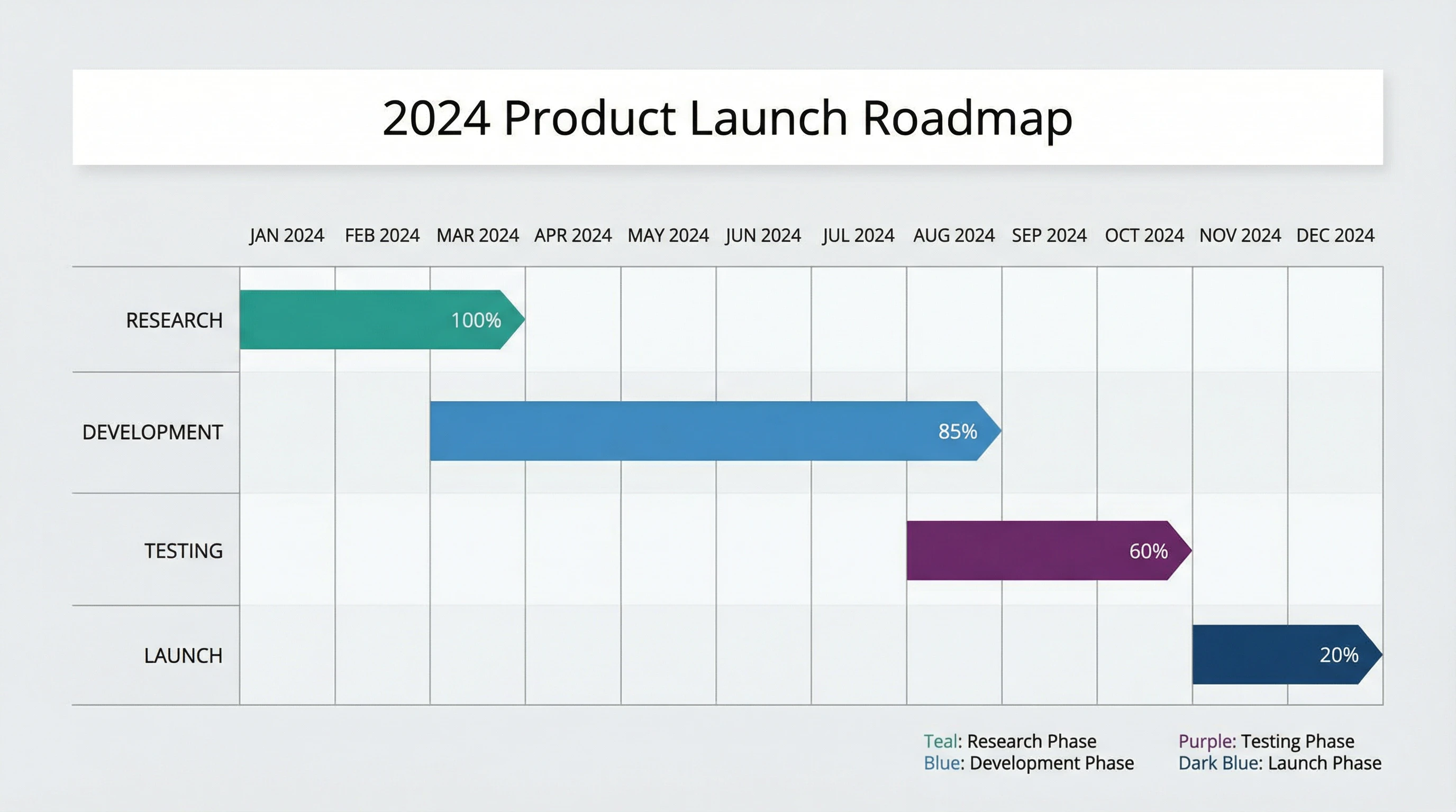
Gantt chart visualization for a '2024 Product Launch Roadmap'. Phases labeled: Research, Development, Testing, Launch. Color coded bars (Teal, Blue, Purple). Clean horizontal layout, high readability, executive summary style.
3.2 Educational & Training Presentations
- Use Cases: Lecture slides, training diagrams, historical timelines, scientific process flows.
- Prompt Example:
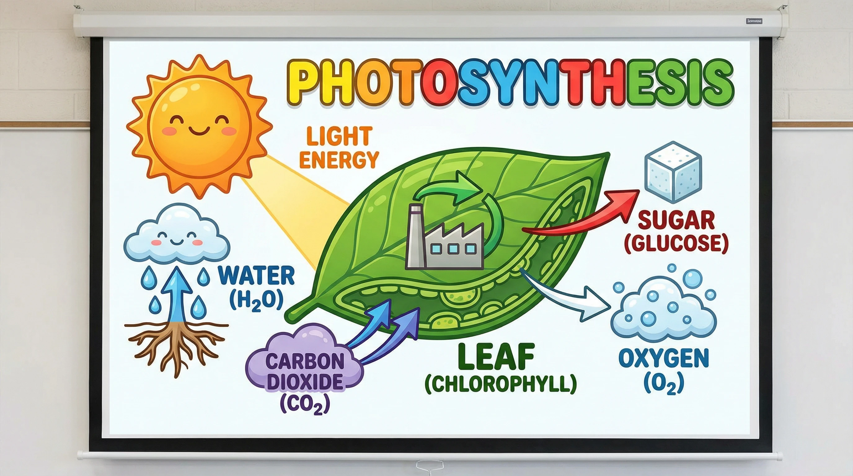
Educational diagram explaining 'Photosynthesis'. Simple, clear illustrations of sun, leaf, water, and CO2. Large font labels. Bright, engaging colors suitable for a classroom projector. 16:9 aspect ratio.
- Key Points: High contrast and large fonts are critical for back-of-class visibility.
- Recommended Model: Nano Banana Pro
3.3 Pitch Decks & Investor Presentations
- Use Cases: Total Addressable Market (TAM) bubbles, traction graphs, hockey-stick growth curves.
- Prompt Example:
Line graph showing 'User Growth' with a steep upward hockey-stick trajectory. Sleek, dark mode aesthetic. Neon green line on black background. Glowing nodes at key milestones. Minimalist axis. Tech startup style.
- Key Points: Needs to look sleek, expensive, and visionary. Dark mode often works well here.
- Recommended Model: Dreamina
3.4 Data Reports & Analytics Dashboards
- Use Cases: KPI summaries, heatmaps, complex scatter plots for internal review.
- Prompt Example:
Heatmap grid showing 'Regional Sales Intensity'. varying shades of blue from light to dark. Clean grid lines. Axis labels for 'Product Category' and 'Region'. Professional data visualization style.
- Key Points: Density of information is higher; clarity and precise color grading are essential.
- Recommended Model: SeeDream
4. Presentation Chart Prompt Writing Guide
Creating the perfect chart requires translating data into visual instructions. Follow these strategies for professional results.
4.1 Chart Prompt Structure
Recommended Format:
[Chart Type] + [Data/Subject] + [Data Points/Labels] + [Visual Style] + [Presentation Context]Example Breakdown:
"Vertical bar chart" (Chart Type)
"comparing Q4 regional sales performance" (Data/Subject)
"North America $5.2M, Europe $3.8M, Asia $4.1M, LATAM $2.3M" (Data Points)
"Corporate navy blue, clean white background, large bold labels" (Visual Style)
"suitable for boardroom presentation, 16:9 format" (Presentation Context)
4.2 Chart Type Keywords
Comparison Charts:
- Keywords:
bar chart,column chart,grouped bars,side-by-side comparison - Best for: Comparing categories, regional performance, before/after
Trend & Time Series:
- Keywords:
line graph,area chart,trend line,time series,growth curve - Best for: Revenue over time, user growth, stock performance
Part-to-Whole:
- Keywords:
pie chart,donut chart,stacked bar,percentage breakdown - Best for: Market share, budget allocation, survey results
Process & Flow:
- Keywords:
flowchart,funnel chart,process diagram,Gantt chart,roadmap - Best for: Customer journey, project timeline, decision trees
Correlation & Distribution:
- Keywords:
scatter plot,bubble chart,heatmap,correlation matrix - Best for: Relationship between variables, data density
4.3 Presentation Best Practices
Readability Standards:
Font Size:
- Title/Headline: ≥24pt
- Axis Labels: ≥18pt
- Data Labels: ≥16pt

Contrast:
- High contrast between text and background (4.5:1 minimum)
- Dark text on white background OR white text on dark background
- Avoid low-contrast color combinations (gray on gray)

Simplicity:
- Maximum 5-7 data categories per chart
- Remove unnecessary gridlines
- Clear, concise labels (avoid paragraphs)
- Single focal point per chart
Color Strategy:
- Corporate: Navy blue, gray, black - professional and neutral
- Financial: Green (positive), red (negative), gold (highlight)
- Tech/Startup: Purple, cyan, neon accents on dark backgrounds
- Healthcare: Blue (trust), green (health), white (clean)
- Education: Primary colors, high saturation, clear distinction
4.4 Common Mistakes & Optimization
❌ Poor Example: "chart with sales data"
✅ Optimized: "Vertical bar chart showing Q1-Q4 sales data. Values: Q1 $2M, Q2 $2.5M, Q3 $3.2M, Q4 $4.1M. Corporate blue bars, white background, large axis labels, 16:9 format"
❌ Poor Example: "make a nice looking graph"
✅ Optimized: "Professional line graph showing website traffic growth from Jan to Dec 2024. Smooth upward trend line in teal blue, clean white background, clear month labels on X-axis, high contrast for projection"
Key Optimization Tips:
- Be specific about data points (actual numbers or relative values)
- Always specify chart orientation (vertical/horizontal)
- Request appropriate aspect ratio (16:9 for slides)
- Mention presentation context (boardroom, conference, training)
- Include color preferences aligned with brand
4.5 Negative Prompts for Presentations
Purpose: Ensure charts are clear, professional, and projection-ready
Essential Negative Keywords:
Readability Issues: small fonts, tiny text, unreadable labels,
low contrast, faint colors, blurry, pixelated

Clutter Issues: cluttered layout, too many gridlines, complex background,
distracting elements, messy, overcomplicated

Quality Issues: low resolution, distorted, cropped,
watermark, signature, draft quality

Style Issues: cartoon style, hand-drawn (unless intentional),
3D effects (for flat charts), excessive shadows, gradient overload
Example:
Prompt: "Vertical bar chart showing monthly revenue,
Q1-Q4 data, corporate blue, white background,
large labels, 16:9 presentation format"

Negative Prompt: "small fonts, low contrast, cluttered,
complex background, blurry, low resolution,
hand-drawn, cartoon style, watermark"
5. Presentation Chart Generator FAQs
Q1: Can I import generated charts directly into PowerPoint?
A: Yes! Generated charts are standard image files (PNG/JPG) in presentation-ready formats:
- 16:9 aspect ratio matches standard PowerPoint slides
- High resolution (1920×1080 or higher) ensures clarity on projection
- Drag-and-drop directly into PowerPoint, Keynote, Google Slides, or Canva
Workflow: Generate → Download → Insert into slide → Resize if needed. Charts maintain quality when scaled appropriately.
Q2: How do I ensure my charts are readable from the back of the room?
A: Follow these readability guidelines:
Font Size Rules:
- Always request "large text," "bold labels," or "≥18pt fonts" in prompts
- Test: If you can't read text in the thumbnail preview, it's too small
- Use Nano Banana Pro for best text rendering clarity
Contrast Requirements:
- Specify "high contrast" or "dark text on white background"
- Avoid pastel colors or low-contrast combinations
- Request "clear, bold labels" for maximum visibility
Simplicity:
- Limit to 5-7 data categories per chart
- Request "clean," "minimal," or "uncluttered" layouts
- One message per chart - don't overcrowd
Testing: Generate at 2560×1440 or 4K, view from across the room on your screen
Q3: Which AI model should I use for different presentation types?
A: Choose based on your presentation context:
Nano Banana Pro:
- Financial reports with precise numbers
- Data-heavy business presentations
- Charts requiring clear text labels and data points
- Professional corporate presentations
- When accuracy and clarity are paramount
Dreamina:
- Marketing and sales presentations
- Startup pitch decks
- Modern, visually striking charts
- Creative industry presentations
- When visual impact matters most
SeeDream:
- Executive briefings
- Conservative corporate environments
- Traditional business presentations
- When sophisticated, muted aesthetics are preferred
Q4: How do I maintain brand consistency across multiple charts?
A: Create a standard prompt template:
Method 1: Prompt Template
Base template:
"[Chart type and data]. Corporate style,
[Your brand colors], clean white background,
large clear labels, 16:9 format"

Example:
"Bar chart showing sales by region. Corporate style,
navy blue #003366 and orange #FF6600, clean white background,
large clear labels, 16:9 format"
Method 2: Style Lock
- Keep color palette identical across all prompts
- Use same descriptors ("corporate style," "minimalist," etc.)
- Maintain consistent aspect ratio and resolution
- Use same AI model for entire deck
Method 3: Brand Guidelines Integration
- Specify exact brand colors with hex codes
- Mention brand personality ("professional tech startup," "established financial institution")
- Request consistent typography style
Q5: What resolution should I use for different venues?
A: Resolution guide for presentations:
Standard Conference Rooms:
- Resolution: 1920×1080 (Full HD)
- Most projectors support this natively
- Sufficient for rooms up to 50 people

Large Auditoriums:
- Resolution: 2560×1440 (2K)
- Better for large projection screens
- Venues with 50-200 people

Conference Centers / LED Walls:
- Resolution: 3840×2160 (4K)
- Essential for large LED walls
- Major conferences and events

Online Presentations (Zoom/Teams):
- Resolution: 1920×1080 (Full HD)
- Balance between quality and file size
- Smooth screen sharing

Print Handouts:
- Resolution: 4K preferred
- Ensures print quality
- Can be downsampled for digital use
General Rule: Generate at highest resolution (4K), downsize for specific uses. Never upscale low-resolution charts.
Q6: Can I edit the data in charts after generation?
A: Generated charts are static images, not live data objects. Options:
Option 1: Regenerate with New Data
- Adjust data values in prompt
- Regenerate with updated information
- Fastest for minor changes
Option 2: Image Editing (Inpainting)
- Use inpainting/edit region tools
- Select specific area (label, bar, number)
- Regenerate just that section
- Works for small corrections
Option 3: External Editing
- Import into Photoshop/Illustrator
- Manual text/label adjustments
- Most control but requires design skills
Option 4: Hybrid Approach
- Generate chart without text labels ("no data labels")
- Add precise numbers in PowerPoint as text boxes
- Best for data that changes frequently
Q7: How do I create a consistent look for a 20-slide presentation?
A: Consistency strategies:
1. Master Prompt Formula
Create a reusable template:
"[Chart specific details].
Style: Corporate minimalist,
Colors: Navy blue #003366 and gray #6C757D,
Background: Clean white,
Typography: Bold sans-serif labels,
Format: 16:9, high contrast for projection"
2. Batch Generation
- Generate all charts in one session
- Use same AI model throughout
- Keep style parameters identical
- Only change data/chart type specifics
3. Style Reference
- Generate first approved chart
- If platform supports, use as style reference for subsequent generations
- Maintains visual consistency automatically
4. Quality Control Checklist
- ✓ Same color palette across all charts
- ✓ Consistent font sizes (title ≥24pt, labels ≥18pt)
- ✓ Same background style (white, gradient, or branded)
- ✓ Uniform spacing and margins
- ✓ Consistent aspect ratio (all 16:9)
Q8: What if my chart has incorrect or garbled text?
A: Text rendering troubleshooting:
Issue: Numbers or labels are wrong/gibberish
Solutions:
- Use Nano Banana Pro: Best model for text accuracy
- Simplify Text: Fewer, shorter labels generate more accurately
- Regenerate: Click "Generate" again - often fixes glitches
- Specify Explicitly: "Label bars as: Q1, Q2, Q3, Q4" (exact text)
- Post-Edit: Generate chart structure, add text in PowerPoint
Prevention Tips:
- Keep data labels short ("Q1" not "First Quarter 2024")
- Use numbers over long text when possible
- Request "large, clear text" for better rendering
- Avoid special characters or complex formatting
Q9: Can I use these charts in printed reports?
A: Yes, with proper resolution:
Print Requirements:
- Minimum: 2048×2048 or 2560×1440
- Recommended: 4K (3840×2160)
- Use "Upscale" feature for print-ready output
Print Considerations:
- Color Mode: RGB (for screen) may look different in CMYK (print)
- Resolution: 300 DPI for professional printing
- File Format: PNG (lossless) better than JPG for print
- Proofing: Always request a proof from printer
Workflow:
- Generate chart at 4K resolution
- Download as high-quality PNG
- Import into InDesign/Word
- Verify quality in print preview
- Send to professional printer
Q10: How do I create charts that work on both light and dark mode slides?
A: Create complementary versions:
Light Mode Version (standard):
Prompt: "Bar chart showing Q4 sales.
Navy blue bars, white background,
black text labels, high contrast, 16:9"
Dark Mode Version:
Prompt: "Bar chart showing Q4 sales.
Bright blue bars, dark gray/black background,
white text labels, high contrast, 16:9"
Strategy:
- Generate both versions from same data
- Invert color scheme: dark → light, light → dark
- Maintain same chart structure and proportions
- Use in appropriate slide contexts
Smart Approach: Design entire deck in one mode (light OR dark) for consistency rather than mixing.
Ready to elevate your presentations? Start creating professional, boardroom-ready charts with Nano Banana Pro, Dreamina, and SeeDream today. Transform data into persuasive visual stories that drive decisions!